Image Optimization
Format selection, compression settings, dimensions, srcset, lazy loading, metadata—everything you need to know to serve images correctly.
Format Selection
Format is the highest-leverage decision in image optimization. Two images at identical visual quality can differ by 80% in file size purely because of format choice. Get this right before you touch anything else.
WebP
The default choice for web images. Lossy and lossless modes, alpha channel support, and universal browser coverage. If you're not using WebP, you're over-serving every visitor.
AVIF
Better compression than WebP, especially at low quality settings. Encode times are slower—worth it for high-traffic pages where the file will be downloaded millions of times.
JPEG XL
The most technically capable modern format. Lossless JPEG transcoding, excellent quality-to-size ratio. Browser support is still inconsistent—not ready as a default yet.
PNG
Lossless only. Right for logos, UI screenshots, and anything with hard edges or transparency that would artifact under lossy compression. Wrong for photos.
When to Use Each Format
| Situation | Format | Why |
|---|---|---|
| Photo, hero image, blog image | WebP | Best balance of quality, size, and support |
| High-traffic landing page hero | AVIF | Extra compression savings justify encode time |
| Logo, icon, UI screenshot | PNG or SVG | Hard edges artifact badly under lossy compression |
| Transparent overlay or cutout | WebP | Alpha channel support with lossy compression |
| Animated image | WebP or AVIF | Far smaller than GIF; use video if longer than 3s |
| Vector illustration, icon, diagram | SVG | Resolution-independent, scales to any size |
Quality Settings That Actually Make Sense
Quality settings in lossy formats (WebP, JPEG, AVIF) work on a 0–100 scale, but the useful range is much narrower than that. Below ~60, compression artifacts become visible. Above ~90, file sizes climb steeply with no perceptible quality gain.
The practical ranges by use case:
| Use Case | WebP Quality | Notes |
|---|---|---|
| General web images | 80–85 | Indistinguishable from source at normal viewing |
| Hero / full-bleed images | 85–90 | Larger display size warrants slightly higher quality |
| Thumbnails | 70–80 | Small display size hides compression well |
| Product images (e-commerce) | 85–90 | Quality affects perceived product value |
85 is a safe default for almost everything. The difference between 85 and 95 is rarely visible; the difference in file size is significant.
Dimensions and Responsive Images
Format and quality handle compression. Dimensions handle the other half of the problem—serving the right number of pixels to begin with.
The Dimensions Problem
A 4000×3000px image displayed at 800×600px on screen has 25 times more pixels than the browser will ever render. Every one of those extra pixels was downloaded, decoded, and thrown away. The browser cannot optimize this for you—it downloads the full file before it knows the display size.
Resize images to the largest size they'll be displayed at before uploading. For a blog post with a max content width of 800px, your images should be 800px wide—not 1600px, not original camera resolution. For retina displays (2x), 1600px makes sense. Going beyond that for a fixed-width content column doesn't.
srcset: Letting the Browser Choose
For responsive layouts where the same image slot renders at different widths on different devices, srcset lets you provide multiple image sizes and let the browser pick the most appropriate one based on the viewport and device pixel ratio.
<img
  src="photo-800.webp"
  srcset="
    photo-400.webp  400w,
    photo-800.webp  800w,
    photo-1200.webp 1200w
  "
  sizes="(max-width: 600px) 100vw, 800px"
  alt="[Description of image]"
  loading="lazy"
  width="800"
  height="600"
/>
The sizes attribute tells the browser how wide the image will actually be displayed—not the viewport width. A browser on a 1200px viewport loading an image inside an 800px content column should know it only needs the 800px file, not the 1200px one.
Always include explicit width and height attributes. Without them, the browser doesn't know the aspect ratio until the image loads, which causes layout shift—a direct hit to your Cumulative Layout Shift score.
The picture Element for Format Fallbacks
If you need to serve AVIF to browsers that support it and fall back to WebP for those that don't, use <picture>:
<picture>
  <source srcset="photo.avif" type="image/avif" />
  <source srcset="photo.webp" type="image/webp" />
  <img src="photo.jpg" alt="[Description of image]" loading="lazy" width="800" height="600" />
</picture>
The browser uses the first <source> it supports and falls back to the <img> tag. JPEG as the final fallback means even IE11 gets something—not that you probably care, but it costs nothing.
Loading Behavior, Metadata, and Alt Text
loading="lazy" and loading="eager"
loading="lazy" defers image download until the image is close to the viewport. It's a one-attribute change that can cut initial page load time significantly on image-heavy pages. Add it to every image that isn't visible on first load.
The exception is above-the-fold images—your hero, your logo, anything visible before the user scrolls. Those should be loading="eager" (or no attribute at all, since eager is the default). Lazy-loading above-the-fold images delays the Largest Contentful Paint and actively hurts your score.
fetchpriority="high"
For your single most important above-the-fold image—typically the hero—add fetchpriority="high". This hints to the browser that this image should be prioritized in the network queue. It's particularly effective when the image is your LCP element. Only use it on one image per page; applying it broadly defeats the purpose.
Strip Metadata
Camera images contain EXIF metadata—GPS coordinates, camera model, shooting settings, timestamps. This data is invisible to visitors but adds kilobytes to every file. XnConvert strips it by default when converting. If you're processing images another way, make sure metadata stripping is enabled. There's no reason to serve a visitor the GPS coordinates of where you took a photo.
Alt Text and File Names
Alt text serves two purposes: accessibility (screen readers read it aloud) and SEO (it's the primary signal Google uses to understand image content). It should describe what's in the image specifically—not keyword-stuffed, not empty, not "image of."
❌ Bad
alt="image"alt="photo of office"alt="Vancouver web developer web development Vancouver SEO"✅ Good
alt="Standing desk setup with dual monitors in a home office"alt="XnConvert Output tab showing WebP format selected at quality 85"File names follow the same principle. standing-desk-home-office.webp gives Google useful context before it even looks at the image. IMG_4872.webp gives it nothing.
Use hyphens, not underscores. Google treats hyphens as word separators and underscores as connectors—red-office-chair reads as three separate words, red_office_chair reads as one.
How to Optimize Images with XnConvert
XnConvert is a free, cross-platform batch image converter—Windows, Mac, and Linux. I've used it for over two years and hold a commercial license. It handles an enormous range of formats out of the box with sensible defaults, and the GUI makes it accessible without requiring a build pipeline or command-line setup.
The interface isn't immediately obvious the first time you open it. Here's exactly what to do.
Step 1: Download and Install
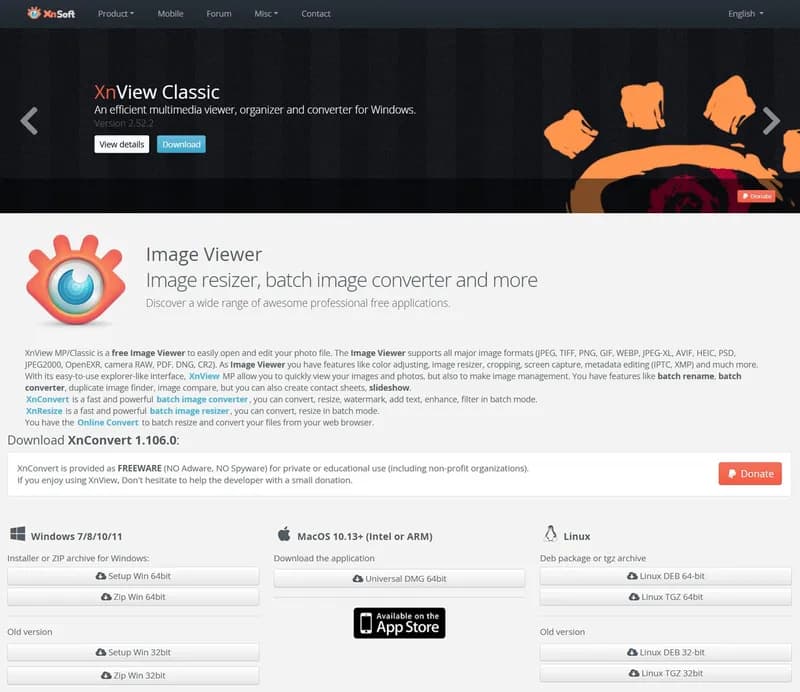
Download from xnview.com/en/xnconvert. Free for personal use, paid license required for commercial use. Install normally—no account required.
Step 2: Understand the Three-Tab Workflow
Input → Actions → Output
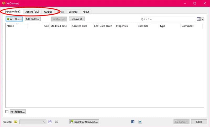
XnConvert has three tabs at the top left: Input, Actions, and Output. You work left to right. This isn't optional—if you configure Output before adding files on Input, nothing will happen and XnConvert won't explain why.
Think of it as a pipeline: Input defines what goes in, Actions defines what transformations to apply, Output defines what comes out and where.
Step 3: Add Your Images
Input tab
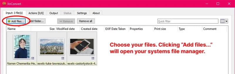
On the Input tab, click Add files… for individual images or Add folder… for a directory. Drag and drop also works. XnConvert lists each file with its filename, dimensions, file size, and format—useful for immediately seeing which files are oversized. In this example I'm adding three JPG files to convert to WebP.
You're not limited to one folder at a time. You can pull in files from multiple locations on your computer in a single session—add one folder, then another, then individual files from somewhere else entirely. XnConvert holds everything as a single list in memory and processes it all in one pass.
The Remove and Remove All buttons below the file list only affect this in-memory queue—they don't delete anything from your computer. If you added the wrong files or want to start over, Remove All clears the list without touching your originals.
Check Subfolders below the file list if you want to include images nested inside subdirectories. The file count updates as XnConvert scans.
Step 4: Add a Resize Action
Actions tab — optional but usually necessary
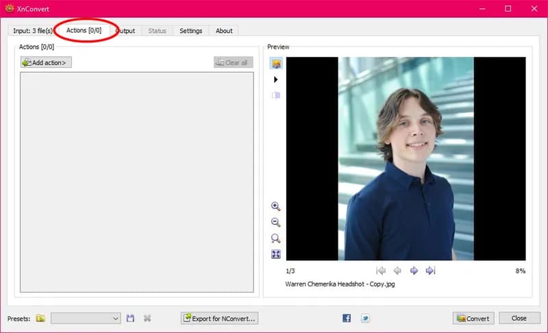
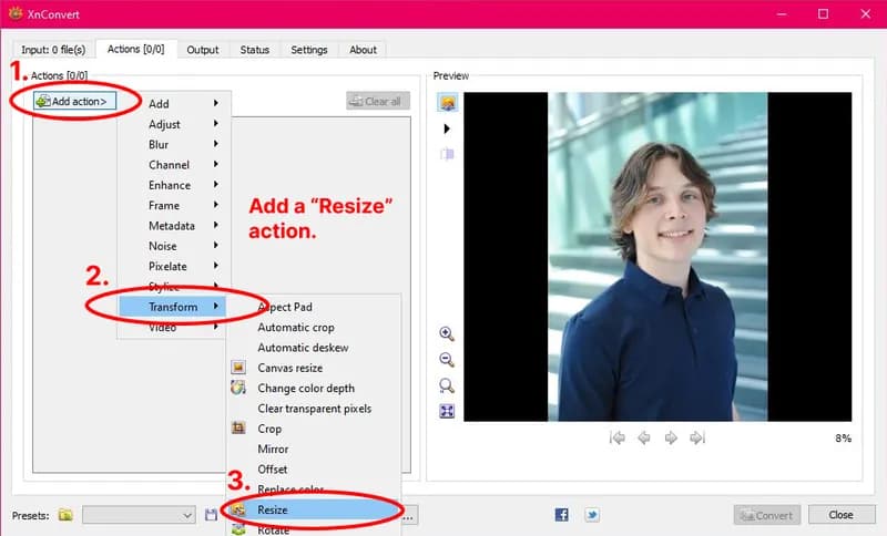
Click the Actions tab. Click Add action… → Transform → Resize.
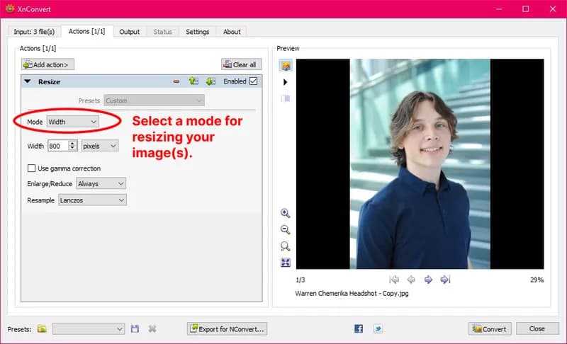
Set width to your maximum display width—in this example, 800px. Set the resize type to Width. For the Enlarge/Reduce mode, use Reduce only unless you know every image in your batch is already wider than the target—if any image is smaller, Always will upscale it, which increases file size and degrades quality. 1200px is a safe ceiling for most blog layouts; 800px works well for content images in a narrower column.
You can stack multiple actions here—resize, then adjust levels, then strip metadata. They execute in order top to bottom.
Step 5: Set Format and Quality
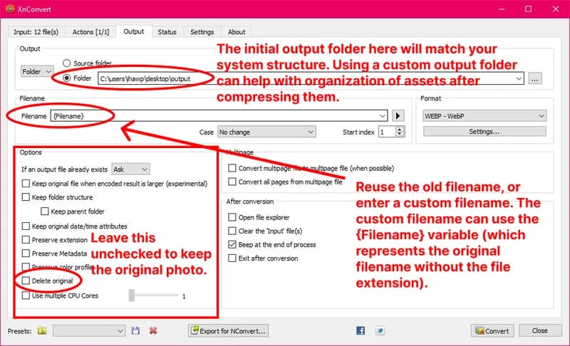
Output tab
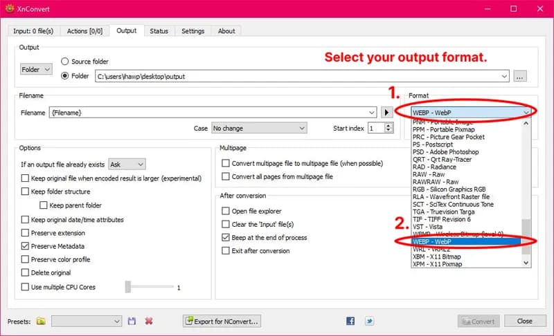
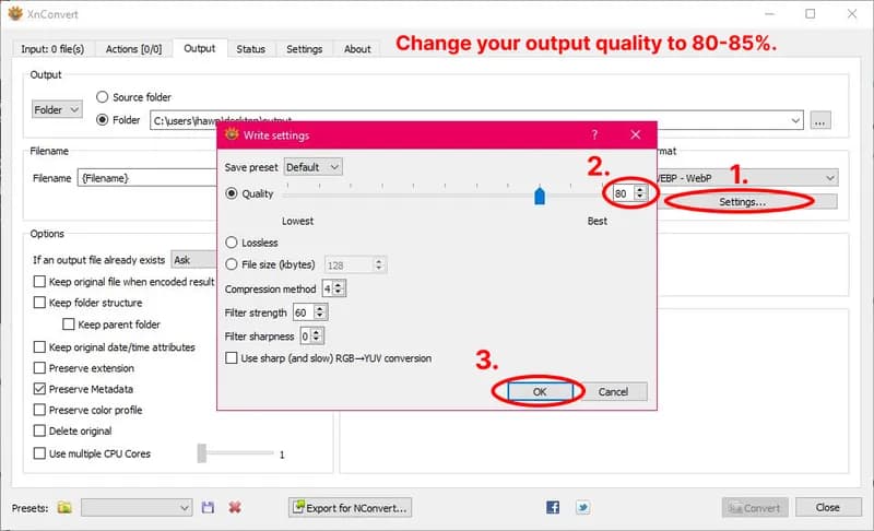
Click the Output tab. The Format dropdown defaults to "Keep original format"—change it to WebP. Once WebP is selected, a settings icon appears next to the dropdown. Click it and set quality to 80. For general content images like these three JPGs, 80 hits the sweet spot—files come out significantly smaller than the originals with no major visible difference at normal screen sizes.
For the output location, select Set a specific folder and point it somewhere you'll recognize. Once your files are converted they'll carry whatever filename they had, just with a .webp extension, as long as the Preserve Extension option is not checked. This is also a good time to properly name your files, but don't worry, I'll remind you again later. Never overwrite your originals. You will eventually need one of them.
Step 6: Convert and Check the Results
Output tab → Convert button
Click Convert. XnConvert processes the list, applies Actions in order, and writes to the Output folder. Three images typically takes under a second.

When it finishes, XnConvert shows a Status screen inside the app with the full results—you don't need to go hunting in Explorer to see what happened. Each file is listed with its source path, output path, original size, converted size, and the percentage reduction. At the bottom you get totals across all files.
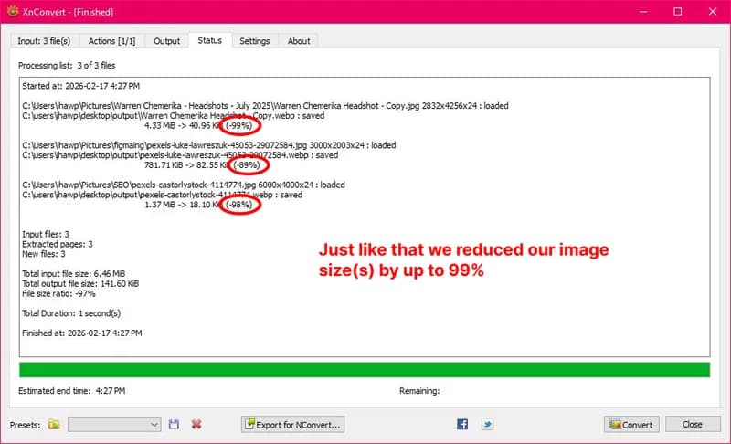
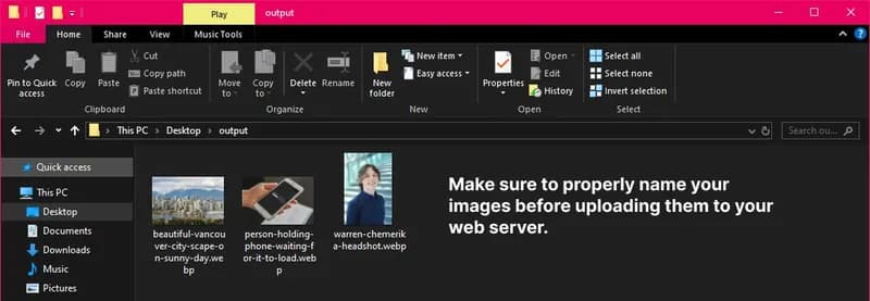
6.46 MB in, 141 KB out, in one second. The headshot alone went from 4.33 MB to 41 KB—a 99% reduction with no major visible quality difference at normal screen sizes. This is why format conversion matters more than any other optimization step. Once you've confirmed quality looks right, your files are ready—make sure they're properly named before uploading to your web server.
Thinking About Your Own Site?
Image optimization is part of every project I take on—not an add-on, just how the work gets done.
Get in Touch